Type:
Web ApplicationClient:
DisclosedYear:
2024This project is under a strict Non-Disclosure Agreement (NDA). As a result, the descriptions provided are generalized, and specific details have been omitted to comply with confidentiality requirements.
Brief Description
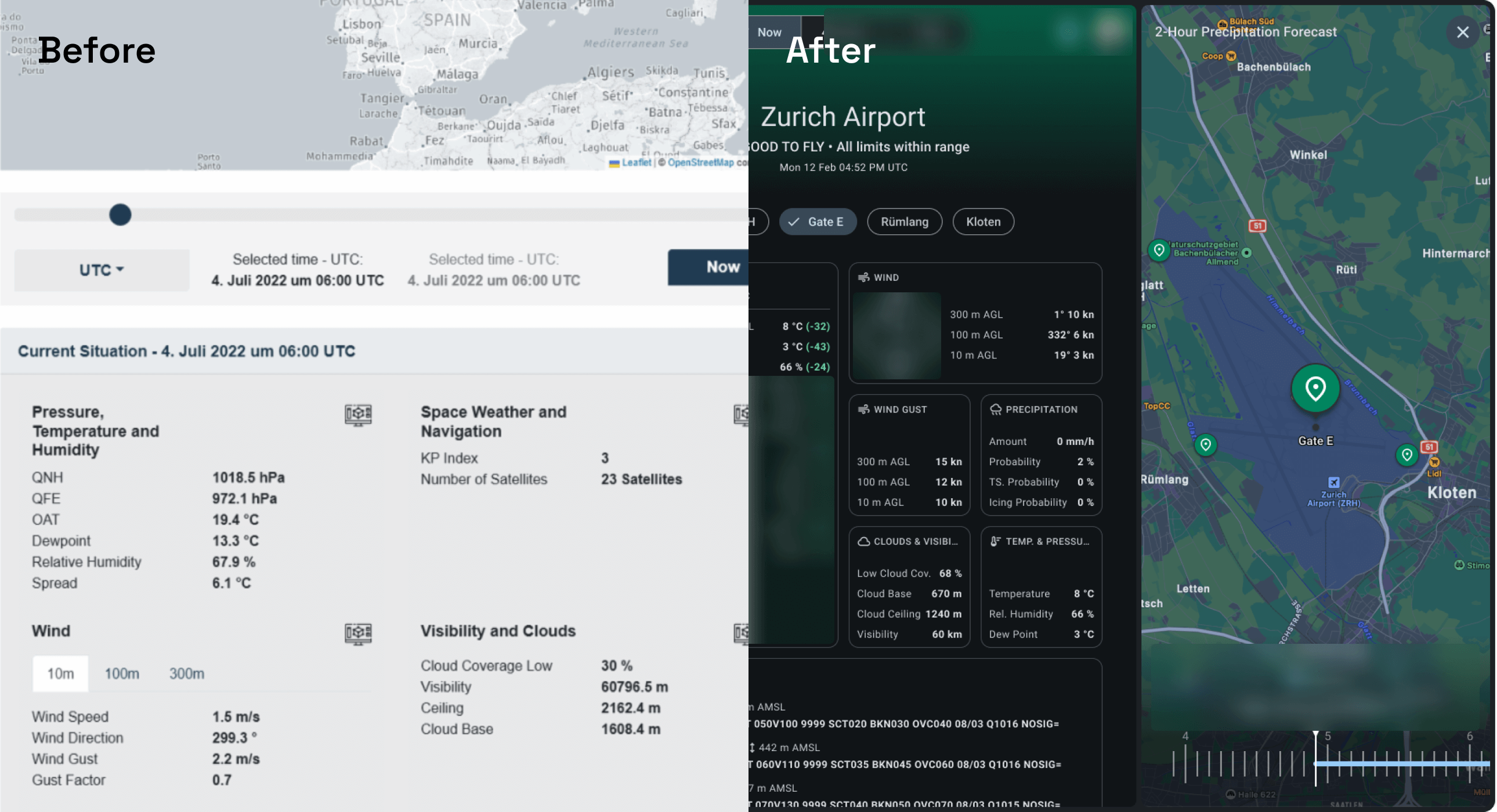
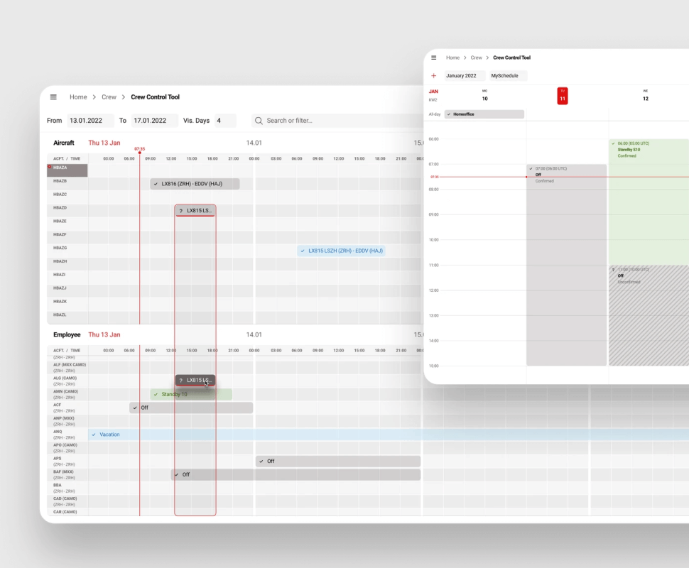
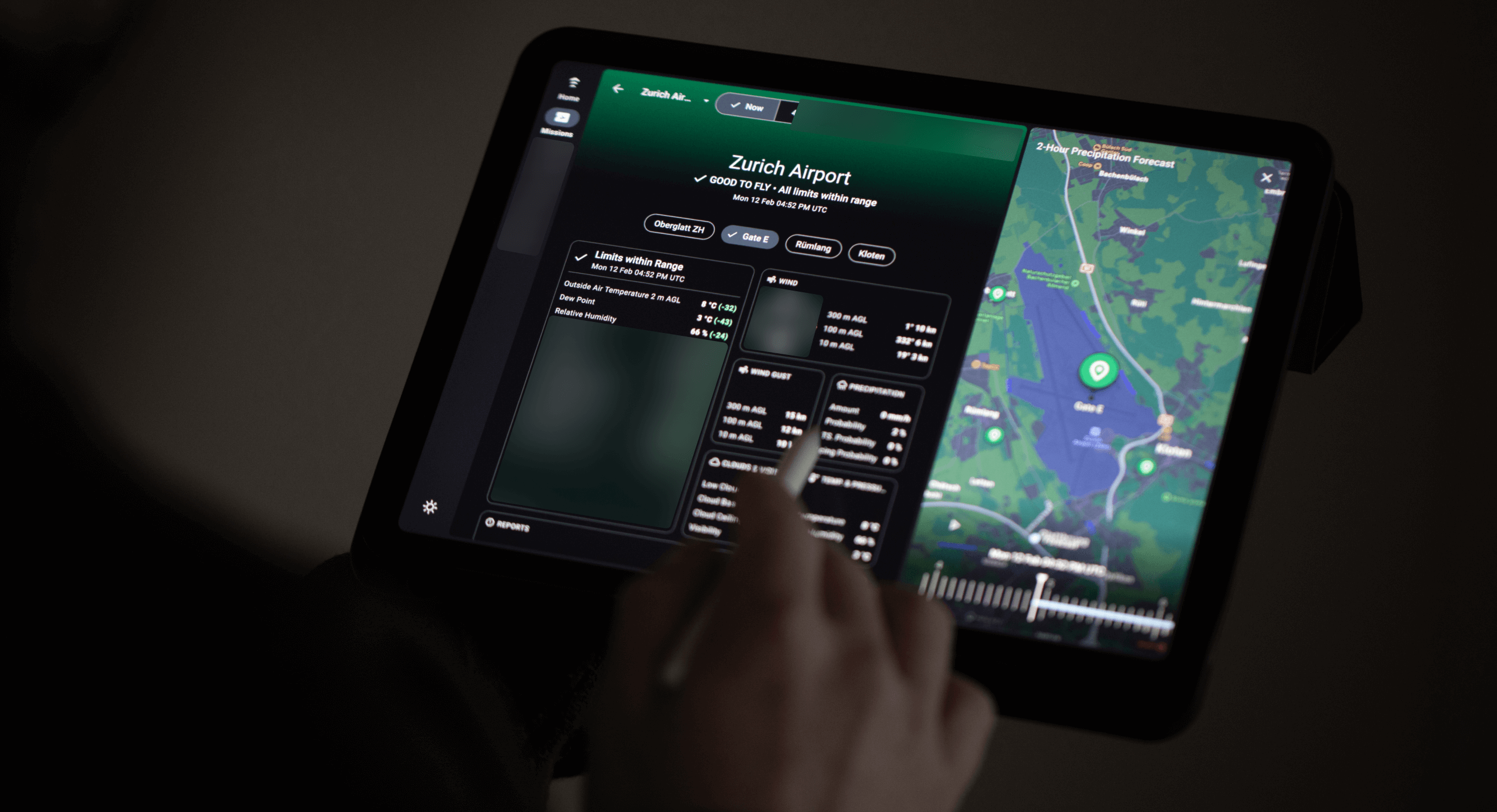
This project involved consolidating several independent web applications into a single, cohesive platform for a client in the technology sector. The goal was to create a state-of-the-art web application that provides users with seamless access to the services they have subscribed to, enhancing usability and overall user experience. The platform is designed to be accessible on various devices, including phones, tablets, and desktops, and is offered as a Software as a Service (SaaS).
Role & Responsibilities
I was the lead UX/UI Designer (contractor) responsible for user research, wireframing, prototyping, and final UI design.
Team
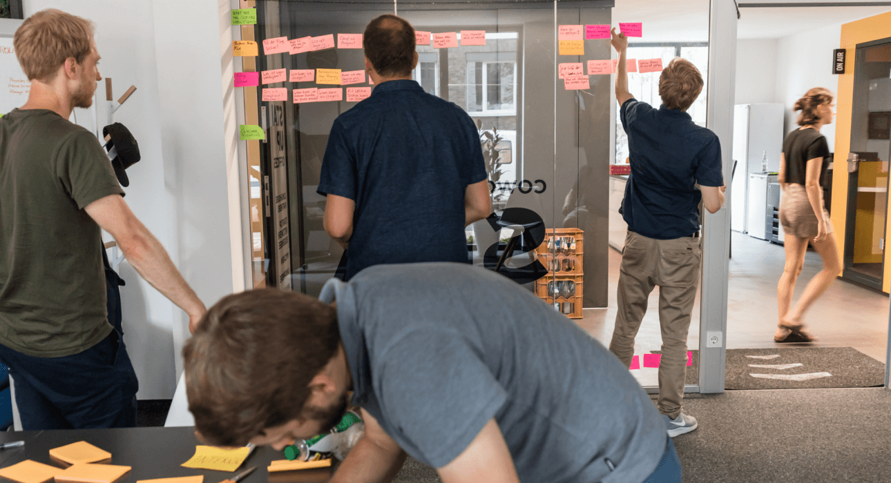
Collaborated with a team consisting of two developers, one product owner, the CTO, the CEO, and a sales lead. Together, we worked closely to ensure the platform met both technical and business requirements, delivering a seamless and user-friendly experience.
Background
The client offers a suite of services that enhance the safety and scalability of drone operations. However, their existing web applications were challenging to use, not mobile-friendly, and had an outdated UI. This resulted in time-consuming introductory calls and setup assistance for new clients.
Challenges
Clients struggled with the cumbersome, independent web applications, leading to inefficiencies and poor user experience. The lack of mobile optimization and a modern interface further hindered usability and sales. The client needed a unified platform to streamline operations, connect services, and manage assets efficiently.
Goals
- Develop a unified, responsive web application that consolidates all services.
- Design an attractive, modern UI to enhance usability and sales.
- Create an intuitive user experience to eliminate the need for setup calls.
- Connect services to enable efficient asset management.
- Ensure the platform is mobile-friendly and globally accessible.
User Research
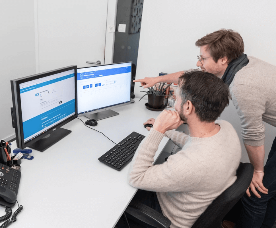
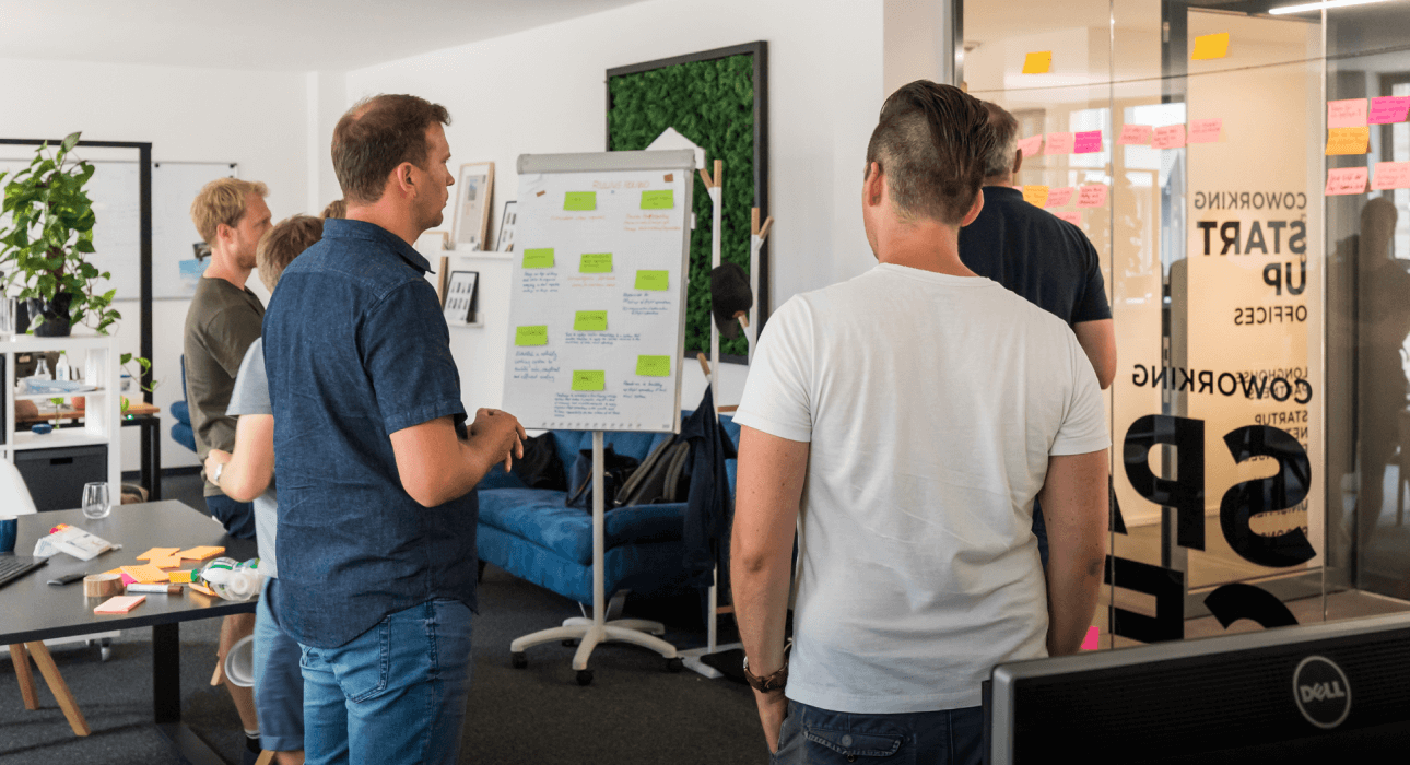
I conducted research by organizing internal workshops to gather challenges from team members and interviewing and shadowing existing clients to understand the context of use, workflows, pain points, and needs/opportunities. This research provided a comprehensive view of both internal and external perspectives on the status quo.
Competitor Analysis
In addition to user research, I performed a thorough competitor analysis to benchmark industry standards and identify potential opportunities for differentiation. This analysis included evaluating the strengths and weaknesses of competitors' platforms, focusing on features, usability, and overall user experience.
Key Findings
Through this research, several key insights emerged:
- The primary issue was the poor user experience of the current applications.
- Clients considered some key features 'nice to have' rather than essential.
- Users were reluctant to adopt another standalone app, preferring an all-in-one solution to streamline their workflow.
- There is potential for some features to become more relevant/essential as the industry evolves.
Personas & User journeys
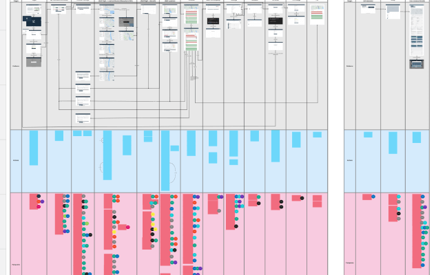
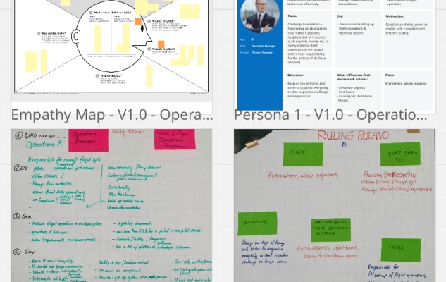
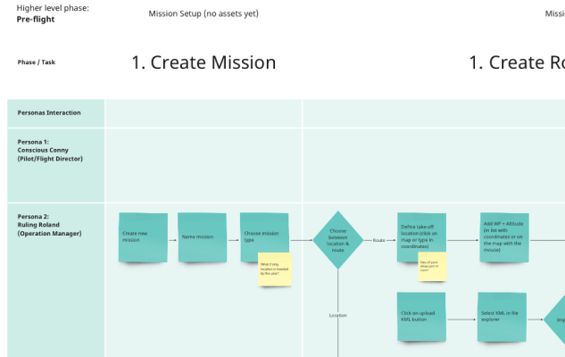
In a workshop format, together with the relevant stakeholders, we identified and defined the main user groups, developed personas based on previously created empathy maps, and mapped out the user journeys to understand the users' steps, actions, goals, experiences, feelings, thoughts, pain points and opportunities.

Ideation
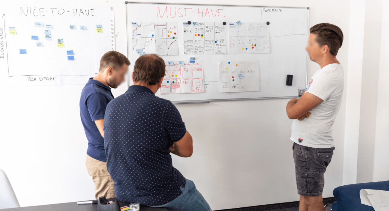
I initiated the design process with a series of workshops. First, together with the relevant stakeholders, the identified pain points were prioritized, and for the highest-priority pain points, we developed potential solutions to address them. Among other methods, I used Crazy8 to encourage rapid idea generation and a large variety of potential solutions. These ideas were discussed and placed in a matrix to estimate business value and development effort. This approach ensured diverse perspectives, aiming for the best solutions for the user and the client. Furthermore, it fostered a common understanding for successful collaboration.
Wireframes
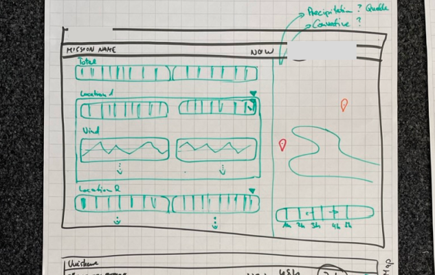
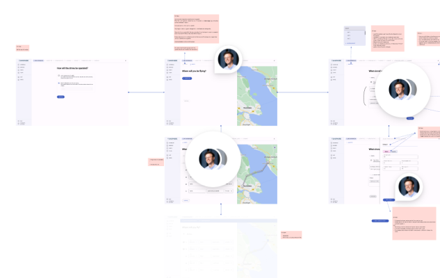
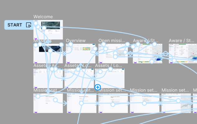
I used Figma to create wireframes, which communicated various concepts based on the workshop outcomes. We held collaborative calls where I presented the wireframes, and together, we made iterative changes directly in Figma. This collaborative approach ensured that everyone felt included and that the wireframes reflected the collective input of the team.
Prototyping
Continuing with Figma, I developed low-fidelity prototypes, typically going through 2-3 iterations before finalizing them for user testing. Although there were no major changes during this phase, the iterative process allowed us to refine the prototypes based on ongoing feedback.
User Testing
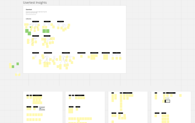
The primary focus of user testing was the setup process for multiple use cases. I employed shadowing as a method to observe how users interacted with the prototype. The insights gathered from these sessions were prioritized not only by the test users but also by the client team, ensuring alignment with business objectives and developer efforts. Based on this feedback, the design was adapted and optimized to better meet user needs and business goals.
UI Design
The final design of the platform embraces a modern aesthetic, heavily influenced by Material Design 3, complemented with numerous custom components to fit the specific needs of the client. The platform features both dark and light themes, catering to user preferences and enhancing usability in different lighting conditions. This contemporary design approach has been praised by clients, who have noted that the web application stands out in the industry.
Design System
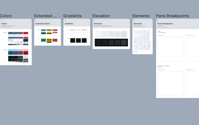
I started with the principles of Material Design 3, creating a comprehensive design system that included all necessary custom components. This design system ensured consistency across the platform, providing clear guidelines on the purpose and usage of each component. By adhering to these guidelines, we maintained a cohesive and intuitive user experience throughout the application.
Interaction Design
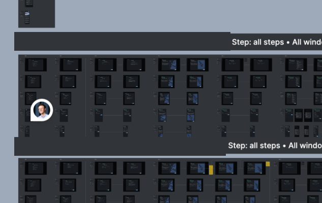
The goal was to have a seamless experience and intuitive interactions across the services in one platform. This required a deep understanding of the subject matter to develop a robust and consistent layout and information structure across multiple devices.

Hand-off
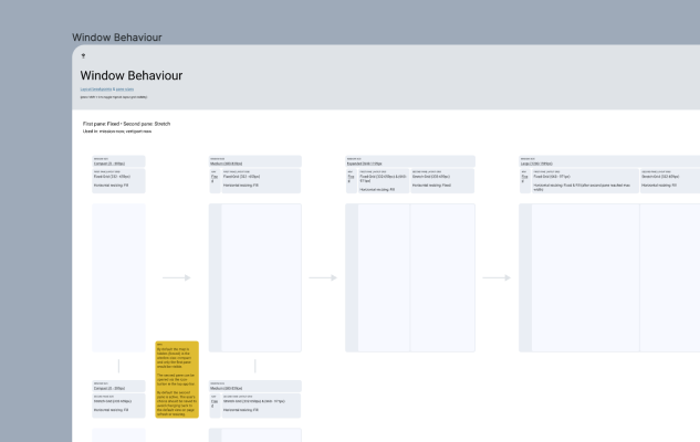
For the hand-off process, I used Figma to provide developers with comprehensive deliverables, including screen flows with annotations, custom components, styles such as typefaces, colors, grids, assets, and behavior descriptions. The primary challenge during hand-off was ensuring that every design detail was implemented as intended. Due to time pressures and the Pareto principle, developers sometimes neglected the final 20% of design details to prioritize essential features.
Collaboration
We conducted weekly check-ins with the development team, which significantly enhanced communication and implementation. During these sessions, I explained and presented the designs, addressing developers' questions to ensure they fully understood the requirements. This collaborative approach helped in achieving a more accurate and high-quality implementation.
